Mobile-First First • 90%+ Mobile Concurrency
Flawless Cross-Device Layouts Engineered for Sub-Second Mobile Speeds
Over 90% of user interactions occur on handheld devices. We construct resilient fluid grid layouts that render flawlessly across smartphones, tablets, foldables, laptops, and 4K ultra-wide displays.
Immediate Response Desk: WhatsApp +91 9330090293
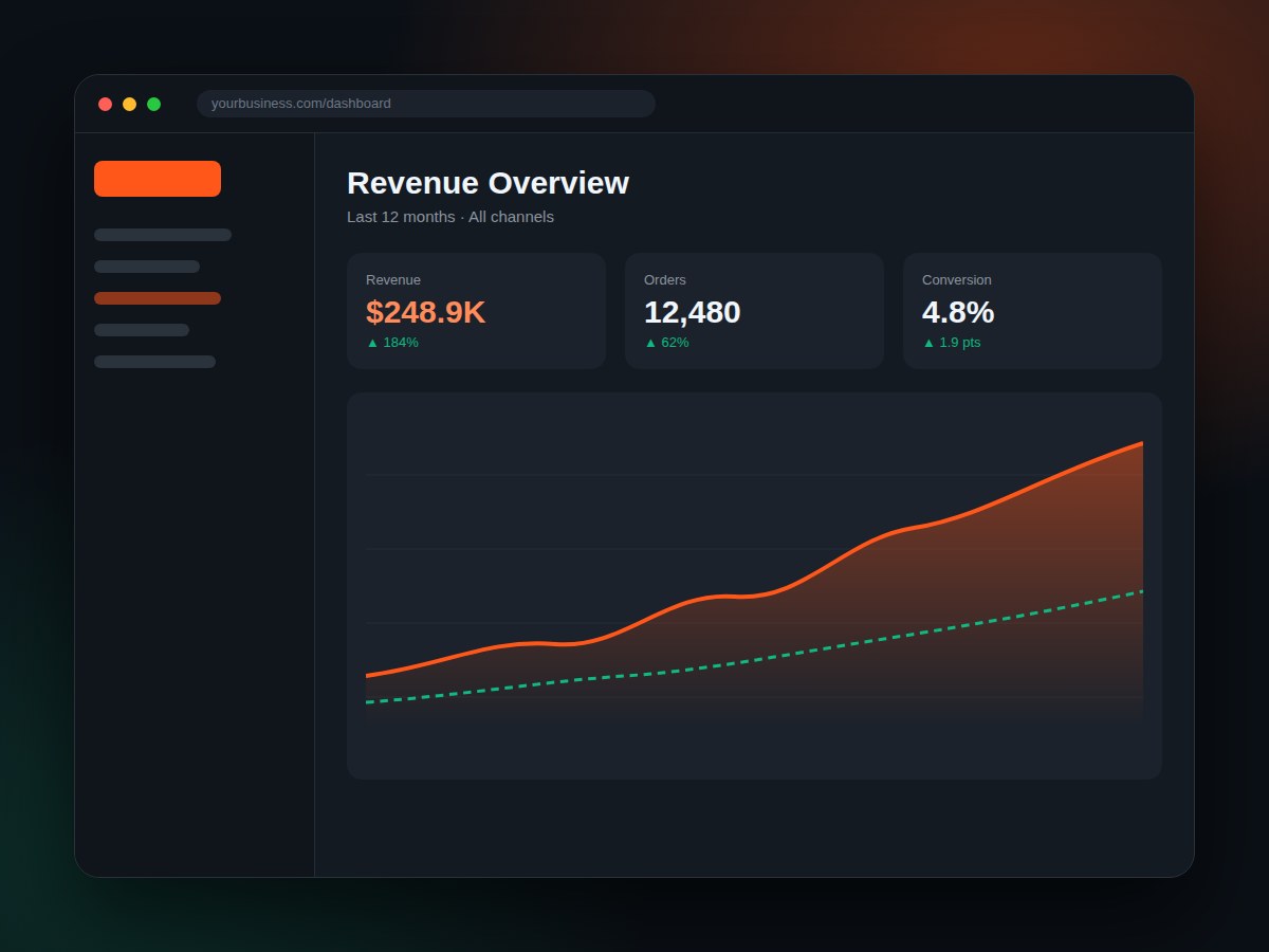
Core Web Vitals
100/100 Score
Yearly Revenue Lift
+184% Scaled
Certified
Google 5.0 ★ Agency
Pixel-Perfect Everywhere
Engineered For Superior Device Adaptability
From touch target ergonomics to fluid typography math, our responsive architectures leave zero friction.
Fluid CSS Grids
CSS3 Media Queries & Fluid Clamp Math
Mathematical scaling for typography and padding that adapts smoothly across any screen resolution without abrupt jumps.
- CSS Clamp Dynamic Typography
- Flexbox & CSS Grid Alignment
- Ultra-Wide 4K Breakpoints
- Zero Horizontal Overflow
Core Web Vitals
Sub-Second Mobile Performance (0.4s FCP)
Pass Google Core Web Vitals with flying colors. We eliminate render-blocking CSS, pre-load critical assets, and compress next-gen AVIF/WebP images.
- 100/100 Mobile Lighthouse
- Sub-400ms First Contentful Paint
- Zero Cumulative Layout Shift (CLS)
- Lazy Loaded Background Media
Touch Ergonomics
Touch-First Mobile UX Architecture
Ergonomic 44px+ touch targets, thumb-friendly sticky action bars, smooth swipe gestures, and zero frustrating mis-clicks.
- 44px+ Accessible Touch Zones
- Bottom-Anchored Mobile Navbars
- Hardware Accelerated Transitions
- Native-Like Swipe Actions
Dark & Light Adaptive
System Theme & Contrast Harmony
Automatic synchronization with user device preferences (Light Mode, Dark Mode, High Contrast) with WCAG AA compliance.
- Automatic Dark Mode Sensing
- OLED Battery-Saving Blacks
- WCAG AA 4.5:1 Color Ratios
- Anti-Glare Typography Pairing
Cross-Browser
Safari, Chrome, Edge & Firefox Testing
Rigorous real-device QA across iOS Safari, Android Chrome, desktop browsers, and embedded webviews (Instagram, Facebook).
- iOS Safari WebKit Polyfills
- Android Chrome Optimization
- In-App Webview Fallbacks
- Zero Broken Visual Bugs
PWA Ready
Progressive Web App Offline Caching
Transform your website into an installable mobile app with home-screen shortcut badges, push notifications, and offline caching.
- Add to Home Screen Manifest
- Service Worker Cache Strategy
- Push Notification Support
- Instant App Cold Starts
98%
Consulting Success
Measurable pipeline ROI
112+
Worldwide Clients
USA, Canada, India, UK
67+
eCommerce Stores
High transactional scale
15+
Years of Experience
Proven industry expertise
Verified Production Deployments
Client Portfolio & Case Studies

Mortgage Modification • USA
Free MMC
A specialized USA-based mortgage modification company providing dedicated consultation, financial assessment tools, and client intake workflows.
Secure Client Intake
Mortgage Tools · Client Portal · Lead Capture

Retail & Dispensary • Canada
Area 420
Modern retail storefront and digital catalog platform featuring age-verification gateways, real-time inventory tracking, and localized dispensary branch finders.
+180% Store Inquiries
WooCommerce · Age Verification · Store Locator

Professional & Legal • Canada
Blue Seal Immigration
Full-spectrum Canadian immigration portal with interactive visa eligibility assessments, CRS score calculators, and secure client document submission workflows.
+310% Assessment Leads
Eligibility Tools · Document Vault · Appointment Sync

Commercial Construction • Canada
Empire Project
Premier commercial construction and project management portal with interactive development portfolios, architectural plans, and investor relations briefs.
0.4s Ultra-Fast Load
Construction CMS · Portfolio Showcase · Fast CDN

Retail & Beverage Delivery • Alberta, Canada
GP Liquor Home
On-demand liquor store eCommerce platform featuring instant local delivery dispatch, ID verification, live inventory management, and promotional bundles.
Sub-45 Min Delivery Flow
On-Demand eCommerce · Stripe Payments · Inventory Sync

Appliance Installation • Edmonton, AB, Canada
Guru Fix
Professional appliance installation and residential maintenance company based in Edmonton, featuring service booking forms and rapid local dispatching.
Local Service Dispatch
Installation Booking · Edmonton Service · Rapid Dispatch
Responsive FAQs
Responsive Web Design Questions
How we ensure your site is lightning fast and visually striking across all devices.
Why is mobile-first design essential for our business?
Google strictly indexes websites using Mobile-First Indexing. If your mobile layout is clunky, slow, or difficult to tap, your search rankings suffer and your mobile visitors abandon the site immediately.
How do you test on different device screen sizes?
We test across physical iPhones, iPads, Samsung Galaxy phones, MacBooks, Windows laptops, and 4K external monitors to guarantee zero broken elements or unexpected horizontal scrolling.
Can you fix responsive glitches on an existing website?
Yes. We audit your CSS and layout tree, refactor broken media queries, fix awkward text wraps, optimize oversized images, and stabilize layout shifts.
Ready to Elevate Your Digital Footprint?
Looking for an Experienced Team? Request a Call Back
Connect directly with our engineering and design leads. We analyze your requirements and provide a transparent, fixed-scope estimate within 24 hours.
Direct Advisory Desk
Instant WhatsApp Chat
Direct Inquiry Mailbox
FG
Start Your Digital Transformation Today
Join 112+ worldwide enterprises and 67+ launched online businesses.